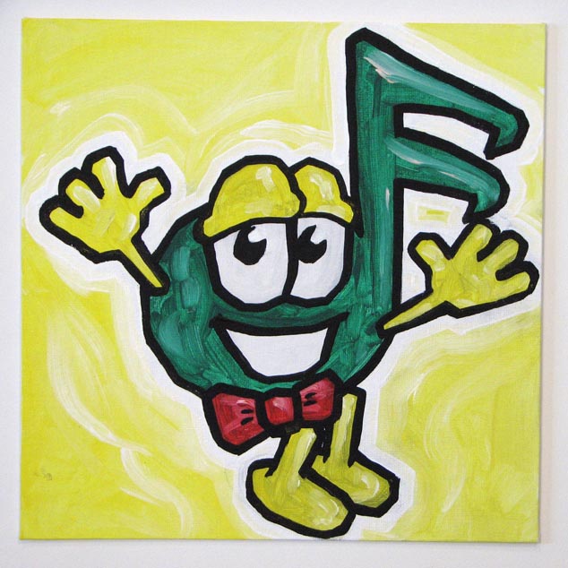
i'm sorry. i'm so so sorry. please don't look. it's not my fault. i was asked to recreate this eye-bleedingly-awful logo. (logo being a generous term here. but yes. a "company" is actually using the image below as their "logo".) i sincerely hope this was created in 1992 in MS Paint. not that it would really be an excuse for such an awful use of color. awkward shapes. thin, weak, unpleasing outlines. and creepy everything else. i can actually tell that this abomination wasn't created in MS Paint because it has that horrid red drop shadow on it. what!? i usually try to be civil with what i post about my requests but this is just horrendous. (it also doesn't help that the requester was difficult to deal with and told me i wasn't "making enough of my artistic gift." whatever the heck that means.) if the guy that created this embarrassment happens to see my post, i'm sorry. . . for your lack of eyeballs. please pick a new profession.
EDIT: my friend just called my attention to this. yikes.


No comments:
Post a Comment